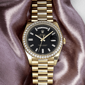
Blue occupies a singular position in watchmaking's dial color vocabulary — more consistently present, more continuously desirable, and more thoroughly explored across generations of fine watch production than any other single color. Yet the blue dial on the Patek Philippe 5270P-016 is not blue in the generic sense that the word might suggest. It is a specific blue: a lacquered gradient that opens at the center in a deep, saturated cobalt — the kind of blue that carries perceptible depth, that suggests altitude or oceanic water rather than sky — and darkens progressively toward the outer perimeter, where the gradient deepens into a near-black rim through the same concentric lacquer treatment that Patek Philippe has applied across the 5270's current generation of dial variants. Against the 950 platinum case's cool, grey-white tone, this blue achieves a chromatic authority that no warmer metal could produce — the platinum and the blue share the cool end of the visual spectrum, their relationship one of harmonic amplification rather than contrasting tension, each color reinforcing the other's depth and precision rather than competing. The 5270P-016 is, within the current 5270 family, the configuration that most fully exploits the platinum case's own chromatic character, deploying against it a dial color that is simultaneously the most expressive and the most materially coherent within the reference's established range.
The 5270P-016 shares its case architecture, movement, and fundamental display layout with the 5270P-015 charcoal gray described in the preceding entry — and since the Calibre CH 29-535 PS Q's technical achievements and the platinum case's concave bezel and two-tier lug architecture have been covered at length in that description, this entry focuses on what the blue dial specifically contributes to the 5270's overall proposition and on the qualities that distinguish the blue configuration from the charcoal within the same reference family. The technical foundation is shared: 950 platinum case entirely polished at 41 millimeters by 12.4 millimeters, the concave bezel framing the dial with its inward-curving precision, the two-tier lugs providing architectural complexity at the case's vertical extremities, rectangular platinum chronograph pushers at two and four, the Calibre CH 29-535 PS Q with its six patented chronograph innovations, 456 parts, Gyromax balance with Breguet terminal curve, 55-65 hours of power reserve at 28,800 vibrations per hour. What changes is the dial, and with the dial, the watch's entire emotional register.
Blue dials in watchmaking function differently from gray or charcoal dials in a specific and important sense: gray dials are neutral in their emotional tone, allowing the watch's complications and materials to speak without chromatic competition. Blue dials are not neutral. They carry emotional associations — depth, precision, the vastness of sky and sea, the coolness of night — that contribute actively to the watch's overall character rather than receding to allow other qualities to dominate. On the 5270P-016, this emotional contribution is significant. The perpetual calendar chronograph is already among the most intellectually demanding objects in watchmaking to fully comprehend — its seven separate calendar indications, its chronograph subdials, its moonphase, its date hand, constitute a quantity of information that asks considerable attention from the person wearing it. Blue deepens this intellectual engagement by attaching emotional dimension to the information: the blue dial does not merely present the perpetual calendar's data, it frames that data within a register of depth and significance that makes the act of consulting the watch feel like more than a glance. This is not a quality that can be engineered; it is what the right color does to the right complication on the right material, and the 5270P-016's blue-and-platinum combination achieves it with a completeness that the reference's other dial colors, for all their individual merits, do not quite match.
The applied "obus"-style hour markers in white gold — the distinctive bullet-form faceted indices that Patek Philippe associates with this reference — stand against the blue ground with a crispness that the blue's saturation amplifies rather than diminishes. Against the charcoal dial, the white gold markers read as precise; against the deep blue, they read as luminous, the cool blue ground making the white gold appear whiter and sharper by contrast in the same manner that platinum amplifies the cool precision of diamonds. The faceted white gold dauphine-style hands carry the same quality: their faceted forms catching the light and redirecting it as sharp, clean highlights against the deep blue ground. The display architecture is identical to the charcoal version — the double day/month aperture at twelve with round day/night and leap year apertures flanking, the thirty-minute chronograph counter at three, the small seconds subdial at nine, the integrated date hand and moonphase at six, the five gold stars on a deep blue starfield, the white tachymeter scale at Base 1000 printed against the black-gradient outer rim. On the blue dial, the moonphase display at six o'clock acquires an additional visual coherence that the charcoal dial cannot provide: the moonphase's deep blue starfield aperture reads as an extension of the surrounding dial color rather than as a contained decorative element within a different-colored ground, the moon rising and setting across a field that is tonally continuous with the dial it inhabits. The integration of moonphase and dial color is among the most quietly resolved details on the 5270P-016, a detail that reveals itself slowly and rewards extended attention.
The Calibre CH 29-535 PS Q powers the 5270P-016 with the same technical specification described for the 5270P-015: manually wound, six patented innovations including horizontal clutch, column wheel, instantaneous jumping minutes counter, patented reset mechanism, and the 22-karat gold disc that serves as the calendar mechanism's oscillating base rather than as an automatic winding rotor. The movement's 456-part construction, examined through the sapphire crystal caseback, presents its finishing to the viewer: beveled and polished steel components, côtes de Genève striping on the bridges, the chamfered edges that the Patek Philippe Seal requires at every component edge throughout the movement. The manual winding character of the movement is itself significant in the context of the 5270's identity — a perpetual calendar chronograph that requires daily winding is a watch that demands engagement from its wearer, that establishes a relationship of habitual attention rather than autonomous function. The blue dial's depth makes this relationship feel appropriate rather than demanding.
The watch is presented on a composite fabric-pattern strap in dark gray with blue stitching — the stitching picking up the blue of the dial and creating the chromatic thread between strap and dial that confirms the watch's material decisions as coordinated rather than incidental. The blue stitching against the dark gray composite fabric carries precisely the tonal relationship that the dial's own blue-and-dark-rim gradient carries: cool blue against near-dark neutrality, each element clarified by the other. The platinum fold-over clasp secures the strap with the material consistency appropriate to the case.
The collector argument for the 5270P-016 over the 5270P-015 is a specific one that is worth stating directly: the charcoal dial is the more conceptually reserved choice, the one that privileges graphic clarity and the platinum case's own material character above all else. The blue dial is the more emotionally committed choice, the one that brings the perpetual calendar chronograph's information into a register of depth and feeling rather than purely clarity and precision. These are not better and worse versions of the same watch; they are different arguments about what the perpetual calendar chronograph should feel like to own and to wear. For the collector who approaches the 5270 as an object that should move as well as inform — who wants the most accomplished complication in Patek Philippe's regular production to carry the same quality of depth in its dial that the CH 29-535 PS Q carries in its movement — the 5270P-016 is the more complete answer.