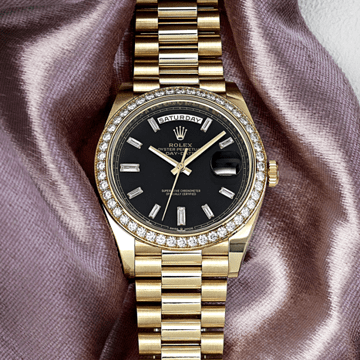
The 7200/50G-001 and the 7200/50G-012 are the same watch. This is a precise statement, not a loose one: the case dimensions are identical at 34.6 by 7.37 millimeters, the officer's-style architecture is the same in every structural detail, the Calibre 240 with its 22-karat gold off-center mini-rotor and 48-hour power reserve operates to the same specification, and the Breguet numerals in white gold with white gold applied cabochons for the minute scale are shared across both references. What differs is the dial color, and with it the strap, and with those two changes — dial and strap — the watch's entire emotional register. Ice blue and sand beige are adjacent in the warmth spectrum: sand beige anchors the warm-neutral pole, ice blue anchors the cool-neutral pole, and the white gold case sits precisely between them, equally consonant with either color, equally capable of producing a unified composition in either direction. The choice between them is the choice between warmth and coolness as the preferred register of a watch that carries the same formal quality regardless of which direction is selected.
Ice blue is a specific color with a specific character that distinguishes it from the broader category of blue dials available in fine watchmaking. It is not the deep cobalt of a richly saturated dress watch dial; it is not the navy of a sports watch ground; it is not the warm Prussian blue that anchors many of the finest Patek Philippe complications. Ice blue is a light, cool, slightly luminous blue — the blue of a clear sky at altitude, of shallow water over white sand, of the particular quality of northern winter light — and its lightness is its defining quality. At this pale, cool end of the blue spectrum, the color's relationship with the surrounding white gold case is one of chromatic kinship rather than contrast: both the ice blue and the white gold occupy the cool-neutral portion of the visual spectrum, their difference one of hue (white vs blue) rather than temperature (warm vs cool). The result is a composition of particular internal coherence, the dial's blue and the case's grey-white existing in harmony rather than tension.
The sunburst finish applies to the ice blue ground with the same directional light behavior that it produces on the sand beige of the 7200/50G-001: centrifugal brushing radiating from the dial's center, each groove returning light along its length, the overall effect a color that deepens toward the perimeter and brightens toward the center as the wrist moves. On ice blue, this sunburst quality produces a specific visual phenomenon that does not occur in the same way on darker blues: because the base color is so light, the sunburst's variation between the brightest center and the more shadowed perimeter spans a perceptible range from near-white to a deeper, more saturated blue, the dial appearing to hold multiple blue tones simultaneously in a continuous gradient. In direct light, the ice blue center reads almost as white; in lower light, the perimeter's deeper tone dominates, and the dial appears distinctly blue throughout. This light-responsiveness makes the 7200/50G-012 a dial that changes character across the day — the ice blue of morning light and the ice blue of afternoon are not the same ice blue, and this continuous variation is among the color's most distinctive qualities.
The officer's-style case architecture — the hinged dust cover with its invisible hinge, the straight lugs with screwed-in strap bars, the entirely polished white gold surface — is covered in the 7200/50G-001 description at sufficient length that a full architectural treatment here would repeat rather than add. What is worth noting for this specific reference is how the white gold case's cool tone amplifies the ice blue dial's own cool quality in a way that would not occur with a rose gold or yellow gold case. The white gold's grey-white surface and the ice blue's pale cool blue are both operating in the lower-temperature register of the color spectrum, and their coexistence produces a watch whose material temperature — the subjective warmth or coolness of its overall visual character — is uniformly cool without being cold. This is a specific aesthetic effect that requires the specific material combination: the same ice blue dial in a different metal case would be a different watch.
The applied Breguet numerals in white gold stand against the ice blue ground with a quality that differs from their appearance on sand beige. On sand beige, the white gold numerals provide cool precision within warm softness — a chromatic distinction between numeral and ground. On ice blue, the numerals and the ground share the same cool temperature, and the distinction between them is one of material rather than color: the white gold's metallic surface against the lacquered blue produces a visual separation that is more subtle than a high-contrast situation would produce, the numerals appearing to float within the dial's blue surface rather than to stand apart from it. This subtle integration of numeral and ground gives the 7200/50G-012's dial a quality of refinement — almost understatement — that the sand beige version's more clearly distinguished numerals do not provide in the same form. The white gold pear-shaped hands carry the same relationship to the blue ground: their cool metallic tone harmonizing with rather than contrasting against the dial.
The Calibre 240 requires no additional treatment here beyond noting that its operation — 21,600 vibrations per hour, Gyromax balance, Spiromax silicon hairspring, 48-hour power reserve, 22-karat gold off-center mini-rotor at bridge level enabling the case's 7.37-millimeter height — is identical to the 7200/50G-001's. The sapphire caseback reveals the Calibre 240 beneath the lifted officer's cover with the same two-stage ritual. The movement's quality is independent of the dial color above it.
The pearlescent ice blue alligator leather strap is the 7200/50G-012's most tonally distinctive component, and the word "pearlescent" requires specific attention. A pearlescent surface finish adds a slight iridescent quality to the material's base color — the strap's ice blue leather carries a subtle shimmer that shifts between blue and near-white depending on the angle of observation, the pearlescent coating's light interference producing the gentle color variation that pearl leather has always been associated with. Against a matte or conventionally finished strap of the same blue, this strap reads differently: where a matte strap would be a single, flat ice blue, the pearlescent finish adds movement to the strap's surface, the leather appearing luminous rather than simply colored. At the scale of a ladies' watch strap, this luminous quality reinforces the watch's overall cool-and-light aesthetic — the ice blue of the dial, the grey-white of the case, and the pearlescent blue of the strap as a unified composition of cool luminosity. The white gold prong buckle closes the strap with the material consistency appropriate to the case.
The collector who arrives at the 7200/50G-012 rather than the 7200/50G-001 has made a specific choice about temperature. Both references are completed expressions of the same watch design, and neither is the superior choice by any absolute standard. The sand beige is the choice for warmth — the dial, strap, and case as a unified warm composition that wears as a continuous presence of gentle, accumulated heat. The ice blue is the choice for luminosity — the dial, strap, and case as a unified cool composition that wears as a continuous quality of light and clarity, the specific blue that looks most like the inside of a cloud when the sun is directly behind it. It is, for the wearer who is drawn to that quality, an entirely satisfying answer to the question of what a Calatrava should be.