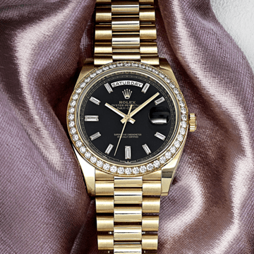
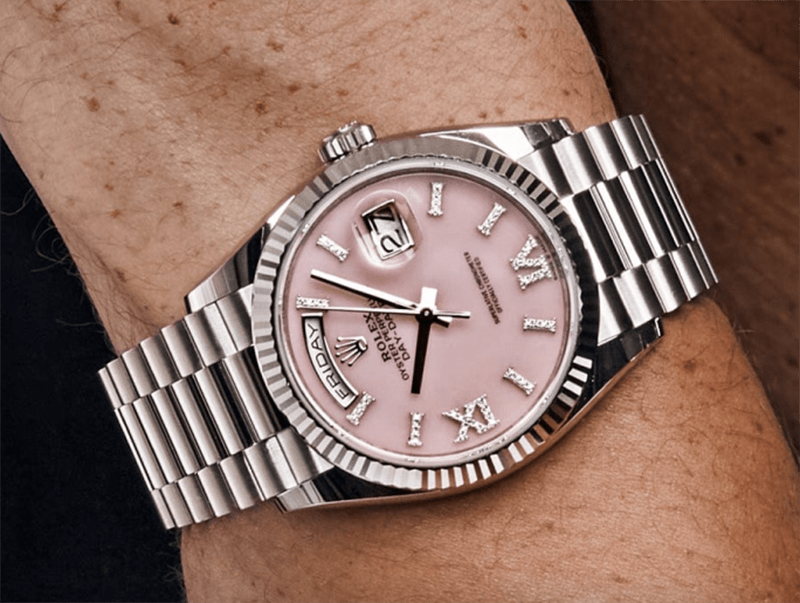
There is a version of Rolex that most people know — the version that produces, with extraordinary consistency and accumulating cultural authority, some of the most recognizable and functionally excellent watches in the world while maintaining an aesthetic discipline that rarely departs from the classic, the legible, and the resolved. And then there is a version of Rolex that appears intermittently — in the puzzle-piece enamel Day-Date, in the Celebration bubble dial, in the watches that suggest the manufacture contains, alongside its considerable engineering ambitions, a genuine appetite for visual play that most of its production carefully contains. The Oyster Perpetual 41 reference 134300 in multicoloured Jubilee motif dial belongs emphatically to the second category. It is Rolex at its most uninhibited: a dial that fills every available surface with ten individual lacquer colors arranged around the repeating pattern of the "ROLEX" lettering motif, the whole composition producing something that is, depending on one's perspective, entirely joyful or entirely surprising coming from a manufacture of this character. Both responses are legitimate, and neither diminishes what this watch actually represents, which is a technically demanding piece of dial artistry delivered at the standard-issue price of a regular Oyster Perpetual 41.
The Jubilee motif has a specific history within Rolex's catalog that gives the 2026 reinterpretation its particular resonance. The motif was originally created in the late 1970s — a typographic composition in which the repeated letters of the "ROLEX" name form an interlocking surface pattern covering the entire dial, the letters' arrangement creating a visual texture that reads from a distance as an abstract geometric field and resolves at close range into legible typography. This pattern had appeared on select Oyster Perpetual and Datejust references in the original period, its colorful original iterations now among the more collectible dial variants of the era. The 2026 version does not reproduce those dials exactly — this is a reimagining rather than a reissue — but it connects to the same tradition of Rolex exploring what its own name looks like when treated as raw graphic material rather than as a brand identifier. The centennial of the Oyster case provides the specific occasion for this revisitation, and the choice to bring it back in ten colors rather than in any single-tone form is the decision that transforms a heritage reference into a genuine statement about what Rolex's dial artistry is capable of when the conversation moves from legibility toward pure expression.
The technical challenge of producing the Jubilee motif dial in ten individual colors by pad printing is described by Rolex itself as a virtuoso achievement in dial creation, and the description is not marketing hyperbole. Pad printing — the process by which a silicone pad picks up ink from an etched plate and transfers it to a three-dimensional surface — is the standard method for applying detailed, precise color patterns to watch dials, but applying ten distinct colors to a single dial, each in a separate pass, while maintaining the precise registration required for the letters and geometric forms to align correctly across the full surface, is a genuinely demanding operation. The ten colors are applied one at a time in a sequence that must account for the overlap between adjacent colors, the drying time between passes, the dimensional stability of the dial substrate across multiple applications, and the need for each color's coverage to be consistent and complete. The slightest misregistration — a fraction of a millimeter in the positioning of any single color pass — would produce a visible error in the completed pattern, and the pattern's complexity, which contains no significant areas of empty space where a registration error might be concealed, ensures that any imprecision is immediately apparent. Rolex's willingness to deliver this dial at the price of a standard Oyster Perpetual 41, without the premium that the added production complexity might justify, is itself a statement about the manufacture's confidence in its own dial production capabilities.
The case of the 134300 is the standard Oyster Perpetual 41 architecture, and the context it provides for the Jubilee motif dial is as important as the dial itself. The 41-millimeter Oystersteel case — with its smooth, domed, polished bezel; its Twinlock screw-down crown providing 100 meters of water resistance; its brushed-and-polished Oyster case finishing; its clean, unornamented silhouette — provides the most neutral possible visual frame for a dial this assertive. There are no competing elements at the case level: no bezel decoration, no crown guards, no complications, no material variation. The case is, architecturally, a circle of metal around a circle of dial, and in this configuration that simplicity is a design decision as much as a practical one — the case steps aside entirely and allows the dial to make every visual argument the watch is capable of. At 41 millimeters, the Jubilee motif occupies a surface area large enough for the pattern's complexity to resolve clearly, each of the ten colors having sufficient coverage to register as a distinct element rather than being compressed into illegibility by the dial's size.
The applied hour markers are white — rendered in polished steel with Chromalight luminescent fills, their stark white presence floating over the multicolored surface below and providing the dial's only elements of conventional legibility architecture. The hands are also white-tipped, Chromalight-filled, their brightness similarly assertive against the colored ground. The "Rolex" and "Oyster Perpetual" text appears in white at the top of the dial, and the certification text in white below center. The management of these white elements against the Jubilee motif's ten-color surface is one of the more delicate design decisions in the watch's construction: the white must be bright enough to provide legibility contrast, but the dial beneath must be complex enough that the white elements don't read as interruptions of the pattern. Rolex achieves this balance — the white markers and hands float above the color field with the clarity of purpose that a time-display element requires while the pattern beneath them continues uninterrupted, the two layers of information coexisting without conflict.
The movement is Rolex's Calibre 3230, shared with the standard Oyster Perpetual 41 production and carrying all of the technical attributes appropriate to a Superlative Chronometer-certified manufacture movement: the Chronergy escapement for improved energy efficiency, the Parachrom hairspring in its paramagnetic niobium-zirconium alloy, the Paraflex shock absorbers, the variable-inertia balance wheel with Microstella nut regulation, the 70-hour power reserve from the bidirectional Perpetual rotor. The movement carries the 2026 strengthened Superlative Chronometer certification, confirming precision to within plus or minus two seconds per day under the expanded criteria that now encompass magnetic resistance, reliability, and sustainability alongside the traditional precision and waterproofness standards.
The all-steel Oyster bracelet — three-link Oystersteel construction, brushed link surfaces with polished edges, Oysterclasp with Easylink 5-millimeter comfort extension — provides the case's neutral material language at the wrist, the steel's cool, tool-watch character providing the same deliberate understatement as the case's own unornamented surfaces. On the wrist, the Jubilee motif dial occupies the center of a composition whose surrounding elements are, by every measure, classic Rolex: standard case, standard bracelet, standard movement, standard finishing. The dial is the entire aesthetic event, and the surrounding understatement is the condition that makes it one.
The collector context for the 134300 Jubilee motif is shaped by the specific tradition of Oyster Perpetual colored dial editions as a category. Since the 2020 introduction of the Stella-inspired color dials that briefly made the Oyster Perpetual one of the most discussed watches in the market, collectors have understood that the Oyster Perpetual's dial is its primary variable and that Rolex exercises that variable with genuine intentionality. The Jubilee motif represents the most complex and most visually aggressive dial exercise the Oyster Perpetual has hosted in the current generation — more demanding to produce than any solid color, more historically connected than the Celebration bubble dial, and more immediately recognizable as a Rolex-specific graphic vocabulary than anything that came before it. It is the Oyster Perpetual for collectors who have engaged with the model on its own terms and who understand that the most interesting version of a simple watch is not necessarily the most restrained one.